We get a lot of great feedback about how Gmail helps you be more efficient, keep in touch with family and friends, and get work done. We’ve saved you from forgetting attachments and made sure that you got the right Bob. Over the years, adding countless features to Gmail has made it an increasingly powerful communication hub, but along the way the interface has also become more cluttered and complex.
That’s one of the reasons we’re embarking on a series of interface updates to help strip out unnecessary clutter and make Gmail as beautiful as it is powerful. This is part of a Google-wide effort to bring you an experience that’s more focused, elastic, and effortless across all of our products. The changes are not going to happen all at once. We know that you love and care about Gmail as much as we do, and we’ll be working on these upgrades gradually over the next few months to allow plenty of time to understand and incorporate your feedback into the evolving design.
We’re kicking things off with two new themes for you to try out as a sort of sneak peek at what we’re up to. Starting today, you’ll see the “Preview” and “Preview (Dense)” themes in the Themes tab in Gmail Settings. Why two themes? Our new interface will eventually expand dynamically to accommodate different screen sizes and user preferences, but until then you can pick the information density that you prefer.
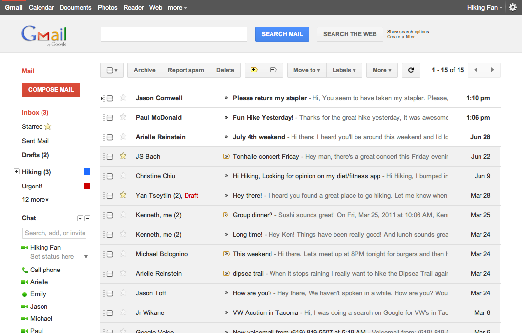
Here’s what one of the new themes currently looks like:

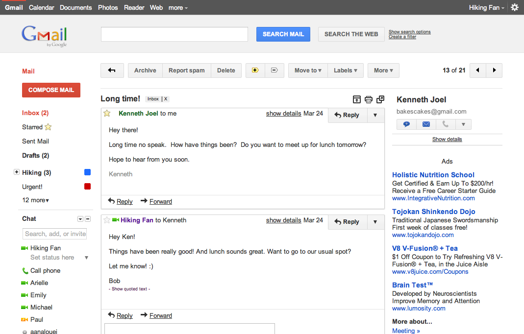
And in conversation view:

Click the images above to see larger versions.
If you poke around you’ll hopefully find a lot to like and a much cleaner, modern look but also few rough edges. In particular, some Labs features may look a little strange in the new themes. We plan to fix these issues as we roll out changes in the coming months. You can also expect some updated themes that embody the same design principles but are better suited to working in a dark environment, use a different color palette, or include the illustrations that we know many of you love to see around your inbox.
Look out for these and other new features over the next few months. In the meantime, try out the new themes as a preview of the future of Gmail and let us know what you think.
P.S. Like Gmail, Google Calendar is also getting a new look. You’ll see it automatically within the next few days so there’s no need to turn it on, and we’ll also continue to make improvements there in the coming months. Details about the current changes to Calendar can be found in the Calendar help center.
That’s one of the reasons we’re embarking on a series of interface updates to help strip out unnecessary clutter and make Gmail as beautiful as it is powerful. This is part of a Google-wide effort to bring you an experience that’s more focused, elastic, and effortless across all of our products. The changes are not going to happen all at once. We know that you love and care about Gmail as much as we do, and we’ll be working on these upgrades gradually over the next few months to allow plenty of time to understand and incorporate your feedback into the evolving design.
We’re kicking things off with two new themes for you to try out as a sort of sneak peek at what we’re up to. Starting today, you’ll see the “Preview” and “Preview (Dense)” themes in the Themes tab in Gmail Settings. Why two themes? Our new interface will eventually expand dynamically to accommodate different screen sizes and user preferences, but until then you can pick the information density that you prefer.
Here’s what one of the new themes currently looks like:

And in conversation view:

Click the images above to see larger versions.
If you poke around you’ll hopefully find a lot to like and a much cleaner, modern look but also few rough edges. In particular, some Labs features may look a little strange in the new themes. We plan to fix these issues as we roll out changes in the coming months. You can also expect some updated themes that embody the same design principles but are better suited to working in a dark environment, use a different color palette, or include the illustrations that we know many of you love to see around your inbox.
Look out for these and other new features over the next few months. In the meantime, try out the new themes as a preview of the future of Gmail and let us know what you think.
P.S. Like Gmail, Google Calendar is also getting a new look. You’ll see it automatically within the next few days so there’s no need to turn it on, and we’ll also continue to make improvements there in the coming months. Details about the current changes to Calendar can be found in the Calendar help center.

No comments:
Post a Comment
Do not post your links, otherwise your comments will be deleted.